Know your data first — Its super important to build models
Exploratory Data Analysis (EDA) is the one the significant process (if not the most significant) in building a machine learning model for a specific problem because without knowing your data one can hardly make a useful model.
“All models are wrong but some models are useful.” — George E.P Box
EDA enable us to understand the distributions, anomalies and relations between features in the data unfortunately there is no standard procedure or process in place for EDA as it is currently more of an art than science which is why many beginners struggle with EDA and often clueless about how to go about it. Due to absence of any structure some people make a hasty move by applying machine learning algorithms which often produce a sub-optimal model which might work well on specific sample but struggle in production.
EDA is still more of an art and once you in a middle of the analysis things often get tangled if you are going in without a plan so in this blog I will try jot down the heuristic way of how many data scientist approach EDA in my data science projects.
The Bird’s Eye View:
Before jumping right into complex multivariate analysis and finding correlations within data it is a common practice to have a basic understanding of the data such as fields, data types, possible data issues and distributions which will enable us to ask the right questions in in-depth analysis.
Basic Info:
Knowing very basic details such as number of rows, columns, how many fields are having null or missing values can come in handy it is seems pretty basic right? but it will be building block to do more advanced exploration.
# load data into dataframe #
df = pd.read_csv('titles.csv')

# check few rows #
df.head(5)

# shape of data #
df.shape

# basic info #
df.info()
Five Number Summary:
Going beyond basic details five number summary can help you pin-point the key statistics about your data such as mean, median, mode, quartiles, standard deviation, minimum & maximum. These statistics can help figure out if there is anything you need to look into more detail such as a feature having a very high standard deviation or its mean and median are depicting two different center point of distribution (in case of skewness in the data)
# 01. Five Number Summary for Numeric Features #
df.describe()


# 02. Five Number Summary for Categorical Features #
df.describe(include='O')
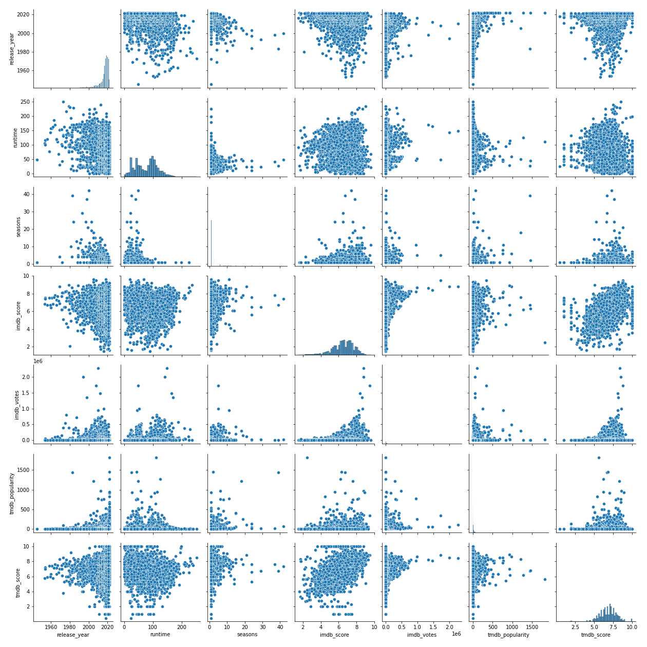
Pairwise Analysis:
In order to get a quick glimpse of relation between all variables pair plot is a fairly quick and easy way to plot all possible combinations for us. These charts allow us to know unusual pattern (if exist) and more importantly it is where we start to build many hypothesis.
# 01. Relevant Imports #
import matplotlib.pyplot
import seaborn as sns

# 02. Pairplot #
sns.pairplot(df)
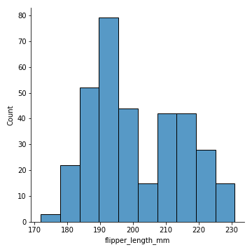
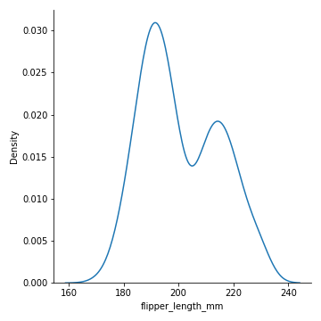
Distributions:
Knowing your data distributions can come in handy while understanding the nature of the data & more importantly when applying statistical methods which have their own set of assumptions and limitation it is a good idea to validate the specific distribution to build a more reliable model.
Though five number summary also provide key statistics about data which provide understanding about distribution but in general it is good idea to plot histogram and density plot to understand the shape, outliers and skewness in the data.
# 01. Imports #
import seaborn as sns
import matplotlib.pyplot as plt
# 02. Load Data #
penguins = sns.load_dataset("penguins")
# 02. Histogram #
sns.displot(penguins, x="flipper_length_mm")
plt.savefig('Histogram.png')
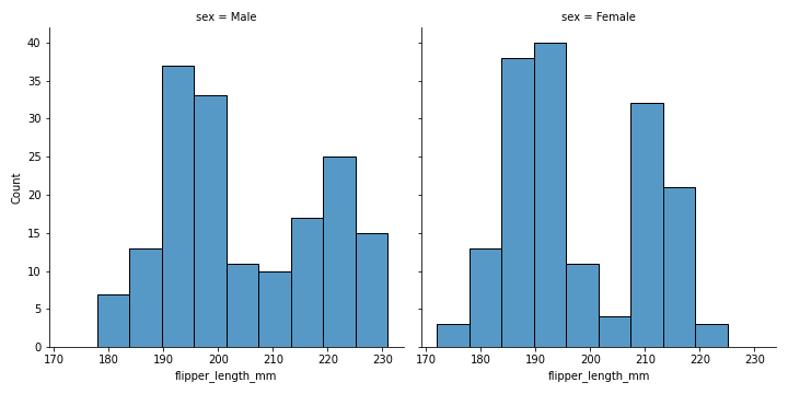
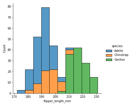
# 03. Histogram with hue and step #
sns.displot(penguins, x="flipper_length_mm", hue="species", element="step")
plt.savefig('Histogram_with_hue_step.png')
# 04. Histogram with hue and stack #
sns.displot(penguins, x="flipper_length_mm", hue="species", multiple="stack")
plt.savefig('Histogram_with_hue_stack.png')
# 05. Histogram with hue and stack #
sns.displot(penguins, x="flipper_length_mm", col="sex")
plt.savefig('Histogram_with_col.png')
# 06. Density Plot #
sns.displot(penguins, x="flipper_length_mm", kind="kde")
plt.savefig('density.png')
 |  |  |
|  |
In general EDA along the way will also provide you with insights about where data cleaning and processing is required because real-world dataset are often not in most desired form.
Deep Dive & build hypothesis:
Once we have basic understanding of the data it is time to dive into more complex analysis by asking questions and building hypothesis along the way.
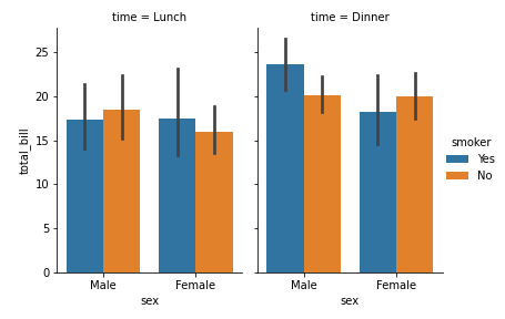
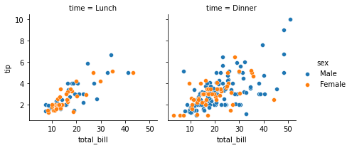
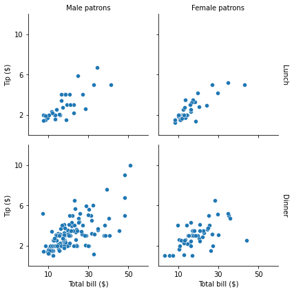
Univariate, Bivariate & Multivariate Analysis:
It is always a good idea to have little information about the data to begin with with questioning the data such as can gender in titanic tragedy impact survival chances? Are discounts driving people to buy coffee at starbucks more than thrice in a week?
# 01. Imports #
import seaborn as sns
import matplotlib.pyplot as plt
# 02. Load Data #
tips = sns.load_dataset("tips")
# 03. Facets - Example 01 #
g = sns.FacetGrid(tips, col="time", hue="sex")
g.map_dataframe(sns.scatterplot, x="total_bill", y="tip")
g.add_legend()
g.savefig("facet_plot_example_1.png")
# 03. Facets - Example 02 #
g = sns.FacetGrid(tips, col="sex", row="time", margin_titles=True)
g.map_dataframe(sns.scatterplot, x="total_bill", y="tip")
g.set_axis_labels("Total bill ($)", "Tip ($)")
g.set_titles(col_template="{col_name} patrons", row_template="{row_name}")
g.set(xlim=(0, 60), ylim=(0, 12), xticks=[10, 30, 50], yticks=[2, 6, 10])
g.tight_layout()
g.savefig("facet_plot_example_2.png")
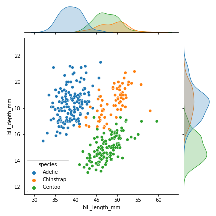
# 04. Joint Plot #
sns.jointplot(data=penguins, x="bill_length_mm", y="bill_depth_mm", hue="species")
plt.savefig('Jointplot.png')
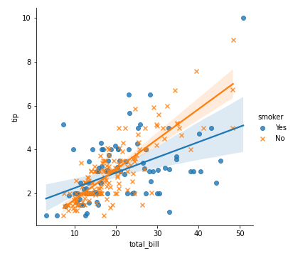
# 05. Linear regression plot #
g = sns.lmplot(x="total_bill", y="tip", hue="smoker", data=tips, markers=["o", "x"])
plt.savefig('lmplot.png')
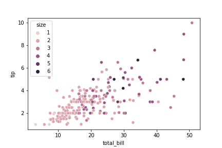
# 06. Scatterplot #
sns.scatterplot(data=tips, x="total_bill", y="tip", hue="size")
plt.savefig('scatterplot.png')
# 07. Barplot or category plot #
g = sns.catplot(x="sex", y="total_bill",
hue="smoker", col="time",
data=tips, kind="bar",
height=4, aspect=.7)
plt.savefig('barplot.png')
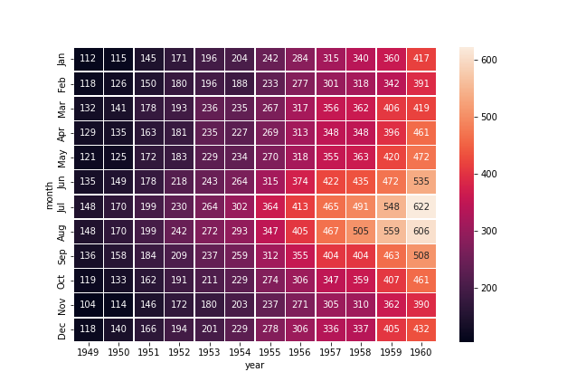
# 08 Heatmap #
# Load the example flights dataset and convert to long-form
flights_long = sns.load_dataset("flights")
flights = flights_long.pivot("month", "year", "passengers")
# Draw a heatmap with the numeric values in each cell
f, ax = plt.subplots(figsize=(9, 6))
sns.heatmap(flights, annot=True, fmt="d", linewidths=.5, ax=ax)
plt.savefig('heatmap.png')
 |  |  |
 |  |
 |  |
Let data visualizations answer the questions about the data and while doing so there will be more questions that will be emerge in the process and often getting more complex hence towards involving more than two variables (multivariate analysis)
For more details about multivariate analysis you can read my blog specifically on this topic here and similarly for univariate analysis you can refer this.
Hypothesis building:
Hypothesis in simple terms “assumptions about the data”. These assumptions will be develop during prior steps. Jot down all the hypothesis and try to validate it by data visualizations in the first place and in the second phase there are more accurate statistical methods for hypothesis testing.
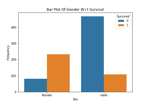
- H0 (Null Hypothesis): Gender has not differentiation power and can’t be used as a feature to predict survival chance of passenger.
- H1 (Alternate Hypothesis): Gender can be relatively a good feature to predict the survival chance of passenger.
As per bar plot there seems to be some significance of the gender over survival chance but it is always a good idea to have statistically validate hypothesis before coming to the conclusion.
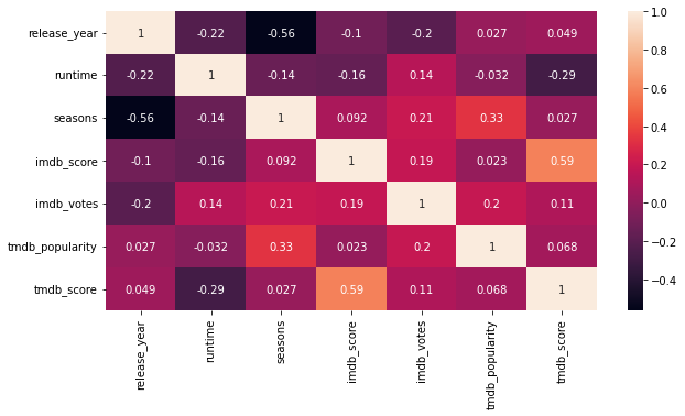
Correlations & Associations:
First thing first “correlation is not causation” in its simple terms it is expressing a relation between two numeric variables and these variables can have positive or negative relation.
Why correlation is not causation? because it can be due to some other cofounding variables such as delivery time in food delivery business might be highly correlated with weekend (where demand is usually high) which suggest a strong correlation between weekend and delivery time but in actual short of working hours (fleet) on weekend seems more plausible reason here and probably a cofounding variable so sometimes correlation can be deceiving nonetheless it is a valuable information to find the features.
While there are different type of correlations for different situations and for which I will be writing a separate blog in the future so right now we are strictly talking about pearson correlation.
# 01. Imports #
import pandas as pd
import numpy as np
import matplotlib.pyplot as plt
import seaborn as sns

# 02. load data #
df = pd.read_csv('titles.csv')

# 03. Calculate Correlation #
corr = df.corr()

# 04. Plot heatmap #
fig, ax = plt.subplots(figsize=(10,5))
sns.heatmap(corr,annot=True)
While correlation is specifically talking about linear relationship between two variables association is on the other hand talks about the some relation (not necessarily linear) between two variable.
Correlation is primarily used for numeric variables whereas association is used for categorical variable to answer questions such as can gender really influence survival chance? Can specific brand of mobile more prone to poor battery life?
Inferential statistics & feature selection:
Hypothesis Testing:
By now you have build few hypothesis from data — Some hypothesis can be nullify through data visualization and analysis only. Hypothesis testing is where more plausible hypothesis go through more accurate statistical methods such as ANOVA, T-Test etc to validate the assumptions about the data. In the following code ANOVA is used to validate if weight of penguins depend on their species.
# 01. Imports #
import pandas as pd
import numpy as np
import matplotlib.pyplot as plt
import seaborn as sns

# 02. load data #
df = pd.read_csv('titles.csv')

# 03. Calculate Correlation #
corr = df.corr()

# 04. Plot heatmap #
fig, ax = plt.subplots(figsize=(10,5))
sns.heatmap(corr,annot=True)
Feature Selection Methods:
Feature selection can be part of feature engineering or it can be included in the EDA. In feature engineering the primary focus is on generating more features or reducing dimensionality.
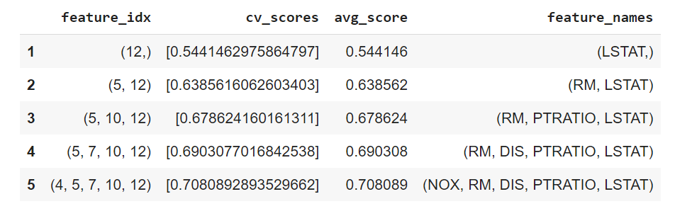
There are three methods which can be used to find the most relevant features hence feature selection.
Wrapper Method — Greedy approach to add or remove feature based on inference draw from model performance.
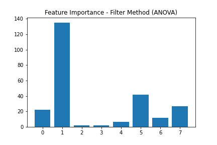
Filter Method — Use statistical test such as correlation, ANOVA and chi-square test to find the most optimal set of features.
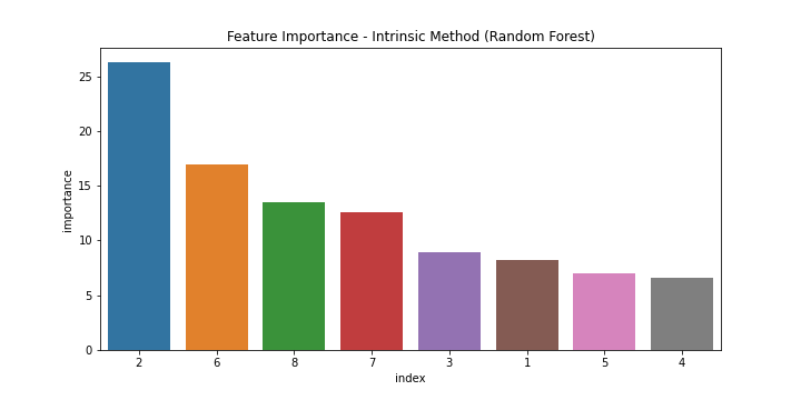
Intrinsic Method — Using machine learning models such as Lasso regression and Random Forest to find the feature importance.
# 01. Imports #
from sklearn.datasets import load_boston
import joblib
import sys
sys.modules['sklearn.externals.joblib'] = joblib
from mlxtend.feature_selection import SequentialFeatureSelector as SFS
from sklearn.linear_model import LinearRegression
import pandas as pd
import numpy as np


# 02. Load Data & convert into pandas dataframe #
boston = load_boston()
df = pd.DataFrame(boston.data, columns=boston.feature_names)
df['PRICE'] = pd.Series(boston.target)

# 03. Data split #
X = df.iloc[:,:13]
y = df.iloc[:,-1]

# 04. Sequential Forward Selection (sfs) #
sfs = SFS(LinearRegression(),
           k_features=5,
           forward=True,
           floating=False,
           scoring = 'r2',
           cv = 0)

sfs.fit(X, y)

# 05. Create a dataframe for the SFS results #
df_SFS_results = pd.DataFrame(sfs.subsets_).transpose()
df_SFS_results
# 01. Imports #
from pandas import read_csv
from sklearn.model_selection import train_test_split
from sklearn.feature_selection import SelectKBest
from sklearn.feature_selection import f_classif
from matplotlib import pyplot
import pandas as pd

# 02. Load Data #
df = pd.read_csv('pima-indians-diabetes.csv')

# 03. Filter Method - ANOVA #
def load_dataset(filename):
	# load the dataset as a pandas DataFrame
	data = read_csv(filename, header=None)
	# retrieve numpy array
	dataset = data.values
	# split into input (X) and output (y) variables
	X = dataset[:, :-1]
	y = dataset[:,-1]
	return X, y

# feature selection
def select_features(X_train, y_train, X_test):
	# configure to select all features
	fs = SelectKBest(score_func=f_classif, k='all')
	# learn relationship from training data
	fs.fit(X_train, y_train)
	# transform train input data
	X_train_fs = fs.transform(X_train)
	# transform test input data
	X_test_fs = fs.transform(X_test)
	return X_train_fs, X_test_fs, fs

# load the dataset
X, y = load_dataset('pima-indians-diabetes.csv')
# split into train and test sets
X_train, X_test, y_train, y_test = train_test_split(X, y, test_size=0.33, random_state=1)
# feature selection
X_train_fs, X_test_fs, fs = select_features(X_train, y_train, X_test)
# what are scores for the features
for i in range(len(fs.scores_)):
	print('Feature %d: %f' % (i, fs.scores_[i]))
# plot the scores
pyplot.bar([i for i in range(len(fs.scores_))], fs.scores_)
pyplot.title('Feature Importance - Filter Method (ANOVA)')
pyplot.savefig('filter_method.png')
pyplot.show()
# 01. Imports #
from sklearn.ensemble import RandomForestClassifier
import pandas as pd
import matplotlib.pyplot as plt
import seaborn as sns

# 02. Load Data #
df = pd.read_csv('pima-indians-diabetes.csv')

# 03. Create X & Y Variable #
X = df.drop(['9'],1)
y = df['9']

# 04. Train Random Foreset #
model = RandomForestClassifier().fit(X,y)

# 05. Fetch Feature Importance #
important_features = pd.DataFrame((model.feature_importances_*100), index = X.columns, columns=['importance']).sort_values('importance', ascending=False)

# 06. Plot Feature Importance #
fig, ax = plt.subplots(figsize=(10,5))
sns.barplot(x='index', y='importance',data=important_features)
plt.title('Feature Importance - Intrinsic Method (Random Forest)')
plt.savefig('Intrinsic Method.png')
plt.show()
 |  |
Final Note:
While there is no standard procedure for EDA — I have tried to put things into a little structure for anyone who is starting their journey into data science. Though this is how I approach EDA and have seen many data scientist to follow similar procedure but I will be more than happy to learn if you know a different approach.
Thank you for your time. You can always reach out at Sehan.Farooqui
Know your data first — Its super important to build models.
- Link: EDA Is More An Art…
- Publication date: Sunday August 14th, 2022
- Author: Sehan Ahmed